HELP?!?!?
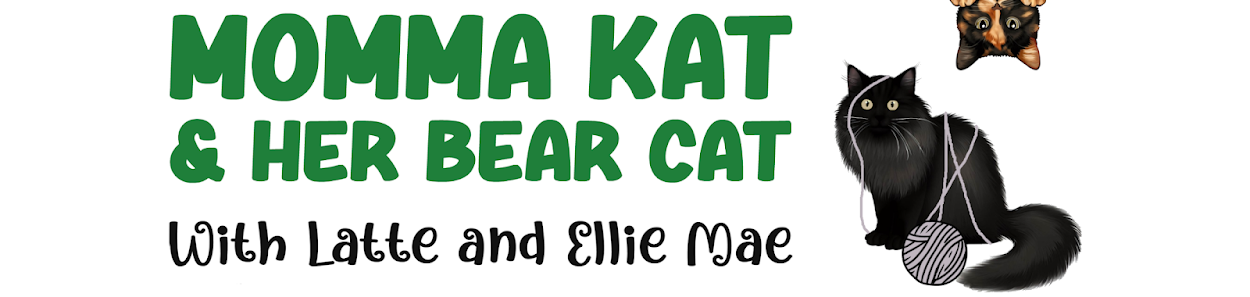
As explained yesterday in Thank you to our incredible friends, we aren't back to blogging every day quite yet. Momma's still struggling a bit and last night was NOT a good night. So in lieu of a new post today, we'd like to ask our readers' opinions. Never one to laze about, Momma used her blogging break to work on a new header for our blog. Since the BlogPaws Conference, back in June, Momma's been meaning to make our header more personal. After a lot of work and consideration, Momma came up with some ideas. Never one to trust her own opinion, we're including the various versions (and evolution) below. We'd LOVE feedback on anything that strikes you or could be improved!!! Or, do you think we should scratch this idea entirely?
If you like this design ...
- Do you like the full hand or the cropped version?
- Which "blurb" describing Momma and Bear's relationship do you like better? Or do you like the old tagline better?
- What could be improved?
THANK YOU for your feedback - and for sticking with us as Momma tries to get her "funny" back!!! Your support, encouragement, and love means the world to us both. ~Momma Kat
1)

2)

3)

4)

5)


We like the full hand best.
ReplyDeleteThank you!
DeleteI like the full hand as well. I like the new tagline, but it does change the overall feel of what your blog may be about. Which is of course fine - it does just provide a tone shift. If you add more green space below the hand, maybe you could get your blog title on the graphic too, if that is what you're going for.
ReplyDeleteThank you. You are right about the tagline. It goes with the graphic, but not the humorous content of the blog. I'm going to have to rethink this one.
DeleteUltimately, whatever tag you go with, I do like them both!
DeleteI like the full hand AND the tag line. Can you just make the graphic smaller so you can have both?
ReplyDeleteFrom Kathleen Muster and The Furry Purrhannas.
DeleteYes, I will work on it! Thank you.
DeleteLooking good! The only thing I would change on the hand graphic is make the letters white or something that stands out. We hope the Momma Kat feels better soon.
ReplyDeleteThank you! Yes, the font color is DEFINITELY changing!
DeleteWell we're glad dat your momma kept busy. Mommy says dat's a good things fur humans when they're goin' thru tough times. We don't mean this to sound critical, so purrlease don't take it dat way. Mommy's old and can't see so good anymore, and so she's havin' a hard time readin' your name and tagline on da new header. When she remade ours, pawrt of it is hard to read, and she's been gonna fix it fur da longest time now and still hasn't done it, so we say better to fix everythin' befur purrin' it up, or you might not ever get 'round to it. But hey, we also say, go with whatever you like or everypawdy else says. We're gonna be here no matter what. Big hugs to you both, and we hope ya'll have a good day. Sendin' purrayers.
ReplyDeleteLuv ya'
Dezi and Raena
No. Your Mommy is absolutely right. I noticed that it was hard to read, but I thought maybe it was my perfectionistic tendencies to never be happy with my work. I can't help but chuckle ... we always have a list of things to do and never find the time to do them. I don't know what it is about blogging - but it seems to be worse for me in that realm. Sending love you both you ladies and your beautiful Mommy :) Thank you.
DeleteI like the pawprint in the hand. Keep the tagline, but makd it easier to read please. We love you Momma Kat and Bear Cat too! Purrs and Snuggles! Kristine and Silver.
ReplyDeleteYes, the text needs to stand out better. Thank you! Your comment made our day and warmed our hearts :)
DeleteI like the pawprint in the hand. Keep the tagline, but makd it easier to read please. We love you Momma Kat and Bear Cat too! Purrs and Snuggles! Kristine and Silver.
ReplyDeleteYes, the text needs to stand out better. Thank you! Your comment made our day and warmed our hearts :)
DeleteI really like the look of the first image, with the entire hand visible. That is beautiful. And I agree with those who commented before, that perhaps you could make the words a bit brighter, or somehow make them stand out more? I think it would look great with or without the tagline, whichever you prefer. It is a beautiful saying either way. Purrs and prayers to you!
ReplyDeleteThank you. We agree with everything you suggest!
Deletewe like #5
ReplyDeleteHugs madi and mom
Thank you!
DeleteOooh, I do love a quiz, I am going for No.1 with text to the side so it doesn't encroach upon the lovely graphic. purrs ERin ps, if I win, can I have a supply of single cream? pps. Your moms "funny" is still with her, and she does a great job. purrs ERin
ReplyDeleteThank you, Erin. You always know how to make a girl feel good :) You are right about the feedback ... and yes, cream it is for the Princess in pink!
DeleteI vote for the full hand version, we love the blurb, and maybe if you could add a splash of color.
ReplyDeleteGreat advice! Thank you. We like the full hand too.
DeleteI like # 4 but maybe with the title print smaller so the view of the hand & paw is not obscured. Keep the blurb as is !
ReplyDeleteYes. It looks too cluttered with the title over the hand and paw! Thank you.
DeleteWe love the open hand! Sweet and clever design.
ReplyDeleteThank you! That's good to hear.
DeleteWASN'T CLEAR ABOUT THE BLURB - i MEANT THE BLURB AS IT IS IN #4. (Thanks to my Torbico Peaches for the caps lock ! We were not yelling, just purring loudly !)
ReplyDeleteThank you :) Oh, yes, I'm very familiar with feline "help" :)
DeleteI love the full hand...but would definitely look for a way to fit your blog name in there too!
ReplyDeleteI agree! Thank you.
DeleteThose are great, I like #3 the best.
ReplyDeleteThank you!
DeleteWe like blurb #4 best. Really don't care for any of the headers that much. They are a nice design but seem too generic to us. The design doesn't really tell us who you are! XOCK, Lily Olivia, Mauricio, Misty May, Giulietta, Fiona, Astrid, Lisbeth and Calista Jo
ReplyDeleteGreat point. Thank you!
DeleteWe fell in love with hand number 4, but I would change the colour of the letters, but only of your names, just to make it more visible. We love the design, MommaKat and BearCat. You're an artist! Good Luck Pawkisses :) <3
ReplyDeleteThank you! I've never been called an artist before :)
DeleteI like the full hand and the tag line. The text doesn't really show up well. Maybe change the color scheme so that you can read the text? Also, am I the only one when I view your blog, your photos/verbage doesn't fit properly. I am not sure if that is the way it displays for me, or if everyone sees it that way. The text appears super wide (across the page), which makes for difficult reading. I sometimes feel less text, properly aligned and less photos (also not going across the page), might be easier on the eyes. I know you weren't asking that, but I have been wanting to suggest that but felt it was none of my business. xoxoxo catchatwithcarenandcody
ReplyDeleteThank you. I'm always looking for feedback. I will look into those things.
DeleteI like the full hand but you need to have your blog name up there. Keep the old tag line please, I think it says more about your blog than the new one.
ReplyDeleteYes, I think you are right about the tagline. Thank you.
DeleteWe like the full hand the best, and the tag line. Maybe another color could make the text more visible ? Purrs
ReplyDeleteGood idea! I think we're changing the text color to a darker blue. Thank you!
Delete